2023.02.10
Seaborn Objects
~ グラフィックの文法で強化された Python 可視化ライブラリの新形態 ~
お久しぶりです。グループ研究開発本部・AI研究開発質の T.I. です。色々あって久しぶりの Blog となりました。今回は、趣向を変え、最近大幅に改良された Python のデータ可視化ライブラリである Seaborn の新しい機能を紹介します。昨年9月にリリースされたばかりということもあるのか、本邦どころか英語で検索しても解説資料は公式サイト以外はほぼ皆無(当方調べ)というレアな情報となります。
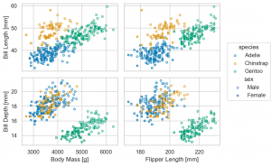
Seaborn Objects を使えばこのような図が簡単に作成できます
- はじめに
- Palmer Penguins dataset による Seaborn Objects の可視化
- その他の Mark, Stat, Move の紹介
- Bar marks
Bar,Bars& Stat objects
Agg,Hist,Count
& Move objectsDodge,Stack,Jitter
- Line marks
DashMark - Line marks
Line,Lines& Stat objects
Norm,PolyFit - Line marks
Range& Stat objectsEst,Perc - Line marks
Path,Paths - Fill marks
Band - Fill marks
Area& Stat objectsKDE - Text marks
Text& Move objectsShift
- Bar marks
- まとめ
- 参考資料
はじめに
データ分析・機械学習などにおいて、データの様々な特徴を可視化しながらの調査・探索(Exploratory Data Analysis (EDA))は、対象の正確で深い理解には不可欠なアプローチと言えます。Python のデータ可視化ライブラリとしては、matplotlib や plotly などが有名です。ただ、この matplotlib は、非常に細かい調整が可能ですが、データの扱いが複雑で大変という問題があります。Seaborn は、matplotlib を拡張し、統計データの可視化をより簡潔にできるようにしたライブラリです。同様に統計分析で力を発揮する Pandas ライブラリと強力に連携でき、私も日々のデータ分析業務で利用しております。しかし、Seaborn のAPIにも様々な限界があり、微調整が難しく、しばしば、元の matplotlib の API と組み合わせるなどのテクニックが必須でした。
そんな Seaborn が、 先日(2022/09)、 version 0.12.0 に update され、新しい Seaborn Objects という Interface が追加されました。これは、R の ggplot2 と同じ Grammar of Graphics (グラフィックの文法)という思想で開発された機能です。これにより、従来のSeaborn の機能では難しい可視化が直感的に自由にできるようになりました。2022.09 に v0.12.0 に major update されましたが、その後も次々に minor update され 2022.12 に v0.12.2 がリリースされています。 (要 Python 3.7+)
- v.0.12.0 September 2022
- v.0.12.1 October 2022
- v.0.12.2 December 2022
これらの minor update で、着々と Seaborn Objects 関係の機能が追加実装されており、今後も更新が期待されます。いくつかの機能はまだ開発中なので、今回の記事はあくまで v.0.12.2 段階のもので将来的に変わる可能性が高いのでご注意ください。
まずは、簡単に Grammar of Graphics について紹介します。これは、Leland Wilkinson が提唱したデータ可視化に関するフレームワークです。R で ggplot2 を利用される方なら、Hadley Wickham による派生系 A layered grammar of graphics で馴染み深い設計かと思います。
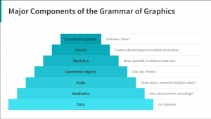
Grammar of Graphics では、グラフィックの構成要素を階層的に取り扱います。
- Data : 最も基礎となる要素
- Aesthetics : データの可視化する軸
- Scale : 数値の scale
- Geometric objects : 点・線・棒など具体的なデータを表現する形状
- Statistics : 平均や広がり、分散
- Facets : Aesthetics 以外の軸で、サブプロットへの分割
- Coordinate system : 座標系(直交座標系 or 極座標)
これらの要素の具体的な Seaborn Objects における実装を見ていきます。まずは、公式サイトに沿って、seaborn.objects を import してみます。
import seaborn as sns # sns.__version__ 0.12.2
import seaborn.objects as so
Seaborn Objects interface で、基本となるものは、seaborn.objects.Plot objectです。それに、Data (pandas の DataFrame) と Aesthetics を指定します。それに add method で、具体的な可視化の形状(Geometric)、データの変換方法(Statistics)などを与えることが基本的な流れとなります。
(
    so.Plot(data, x=..., y=...) #  data (pandas.DataFrame), x,  y column を指定
    .add(Mark, Stat, Move)
)
ここで与えられる Mark, Stat, Moveという object は以下のようになっています(なお、Stat, Move は省略される場合もあります)
Mark : 点や線、具体的な形状
Dot&Dots: 点Line&Lines: 線Path&Paths: 線Dash: 線Bar&Bars: 棒Range: 線Band: 面Area: 領域Text: 文字
Stat : データの変換
Agg: 平均などの集約Est: 標準誤差などの推定Count: 個数の数え上げHist: 個数の数え上げや割合の計算KDE: Kernel Density EstimationPerc: PercentileNorm: 規格化PolyFit: 多項式での fit
Move : Mark を移動
Dodge: 横に並べるJitter: ずらすStack: 積み上げShift: 指定した分移動
上で紹介した add に加えて、 Plot の主な method は以下になります。これらを順々に作用させ、従来の Seaborn API では作成が難しいデータの可視化が直感的にできます。
- specification methods
add: 可視化の層を追加(markの形状やdataの変換)scale: data の単位や色などの性質を指定
- subplot methods
facet: サブプロットに分割pair: 複数のx,y軸でプロット
- customization methods
layout: 図のサイズlabel: label や軸、タイトルなどを指定limit: 可視化される軸の領域を指定share: サブプロットの軸の領域を一致させるか指定theme: プロットのテーマを指定
- integration methods
on:Matplotlibのfigureoraxesobject にプロットする
- output methods
plot: 完了させ表示(Plotter object を戻り値にします)show: 表示(plotと似ていますが、こちらは戻り値がありません)save: ファイルに保存
さて、以下では具体例を踏まえ、これらのAPIの利用例を紹介します。
Palmer Penguins dataset による Seaborn Objects の可視化
では、具体的に新しい objects interface の解説に移ります。なお、今回利用した python, library の version は以下の通りです。
- python version 3.11.0
- seaborn version 0.12.2
- pandas version 1.5.2
- matplotlib version 3.6.2
- pandas version 1.5.2
- numpy version 1.24.1
- plotly 5.12.0
実行は、Visual Studio Code 上の Jupyter Notebook を使用しています。環境により結果が多少異なる可能性があります。
今後のデモで必要なライブラリも最初に import しておきます。
import matplotlib.pyplot as plt
import pandas as pd
import numpy as np
import plotly.express as px

sns.set_theme(context='talk', style='whitegrid', palette='muted')
今回の実験では、palmerpenguins dataset を利用します。
penguins = sns.load_dataset('penguins')
penguins.info()

# <class 'pandas.core.frame.DataFrame'>
# RangeIndex: 344 entries, 0 to 343
# Data columns (total 7 columns):
#  #   Column             Non-Null Count  Dtype
# ---  ------             --------------  -----
#  0   species            344 non-null    object
#  1   island             344 non-null    object
#  2   bill_length_mm     342 non-null    float64
#  3   bill_depth_mm      342 non-null    float64
#  4   flipper_length_mm  342 non-null    float64
#  5   body_mass_g        342 non-null    float64
#  6   sex                333 non-null    object
# dtypes: float64(4), object(3)
# memory usage: 18.9+ KB
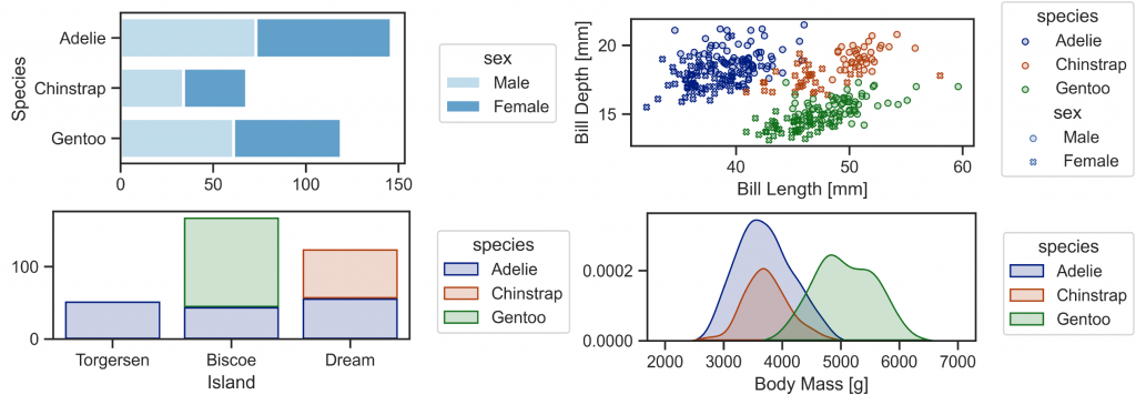
データサイエンスで典型的な例である Fisher の iris dataset では、花びら・萼片の長さ・幅の4次元の量的データと、花の種類の質的データのみですが、 この penguins dataset では、嘴の幅・長さ、羽の長さ、体重の4次元の量的データに、種(アデリーペンギン、ジェンツーペンギン、ヒゲペンギン)、島(トージャーセン島、ビスコー諸島、ドリーム島)、性別と3つのもの質的データを含んでおります。 そのため Iris dataset ではできない、多層的なデータ可視化の例題にはうってつけです(つまりIris の上位互換…)。

(Seaborn とは関係ないですが、Stable Diffusion で作成した Penguin & Iris)
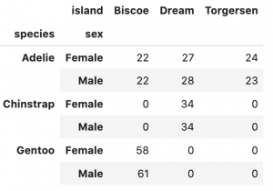
Seaborn Objects で、可視化する前に予めデータの件数を確認しておきます。
penguins.pivot_table(
    index=['species', 'sex'], columns='island',
    aggfunc='size'
).fillna(0).astype(int)
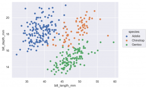
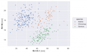
Plot object の基礎と Dot marks Dot (Dots) による scatter plot
so.Plot には、pandas.DataFrame と一緒に x, y となる columns を指定します。 一緒にさまざまな option を指定できますが、その中で、特に利用頻度が高いものは以下です。
color: グループ分け(色)marker: マーカーの種類pointsize: 点の大きさ
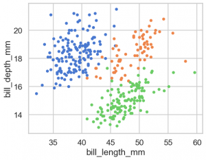
(
    so.Plot(penguins, x='bill_length_mm', y='bill_depth_mm', color='species')
    .add(so.Dot()
)
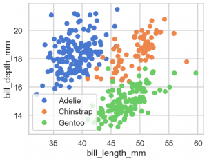
Matplotlib で同様のものを作成するには次のようになるでしょうか。いちいち loop を回して数値を用意して渡すので面倒でやバグが入る可能性があり大変です。
fig, ax = plt.subplots()
for species in penguins.species.unique():
    x = penguins.query('species == @species')['bill_length_mm']
    y = penguins.query('species == @species')['bill_depth_mm']
    ax.plot(x, y, label=species, marker='o', linestyle='')

ax.legend()
ax.set(xlabel='bill_length_mm', ylabel='bill_depth_mm')
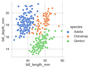
これまでの seaborn なら、まず、作成するグラフに応じた関数を選択して、データを与え軸を指定します。昔はグラフの種類ごとに個別の関数があり不便でしたが、最近では以下の3種類の関数に集約されております。
- sns.replot
- sns.catplot
- sns.displot
sns.relplot(data=penguins, x='bill_length_mm', y='bill_depth_mm', hue='species')
pandas DataFrame からそのまま可視化も可能です。
(
    penguins.assign(species_c=lambda x: x['species'].map({
        'Adelie': 'C0', 'Chinstrap': 'C1', 'Gentoo': 'C2'}))
    .plot.scatter(x='bill_length_mm', y='bill_depth_mm', color='species_c')
)
Plot object の調整
Dot 以外の Mark class を紹介する前に図の調整方法を解説します。
基本的な Plot のmethodは以下になります
layout: 全体のサイズなどを調整label: 各種ラベルを指定limit: 領域を指定scale: 色やmarker、log scale などの調整facet: サブプロットを分割pair: 複数の軸でプロット
それぞれの method は、再度 Plot object を返すので、method を追記して chain できます。Notebook 上では基本的に cell で実行すれば、自動的に表示されると思いますが、 出力に関しては、以下の method があります。
plot: Plot を完了させ、Plotter objectにし、それ以上のmethodによる調整はできなくなります。show:plotと似ていますが、こちらは何も返し値はありません。save: ファイルとして保存します。
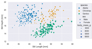
(
    so.Plot(penguins, x='bill_length_mm', y='bill_depth_mm',
             color='species',
             marker='sex',
             pointsize='body_mass_g'
    ).add(so.Dot())
    .label(x='Bill Length [mm]', y='Bill Depth [mm]')
    .limit(x=(30, 60), y=(12, 22)) # 同上、xlim, ylim でなく、直感的に x(y) を指定するだけで楽になりました
    .scale(color='colorblind', marker={'Male': 'v', 'Female': '^'}) # 修正
    .layout(size=(6, 4)) # figure size
    .save('palmerpenguins_bill_length_vs_bill_depth.png', bbox_inches='tight')
)
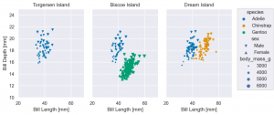
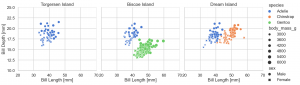
facet サブプロットの作成
(
    so.Plot(penguins, x='bill_length_mm', y='bill_depth_mm',
			color='species',
			marker='sex',
			pointsize='body_mass_g')
    .add(so.Dot())
    .label(x='Bill Length [mm]', y='Bill Depth [mm]',
			title='{} Island'.format) # 以前なら、xlabel, ylabel を指定して設定しましたが、単にx(y)でok
    .limit(x=(20, 70), y=(10, 25)) # 同上、xlim, ylim でなく、直感的に x(y) を指定するだけで楽になりました
    .scale(color='colorblind', marker={'Male': 'v', 'Female': '^'}) # 修正
    .layout(size=(8, 4)) # figure size
    .facet(col='island') # facet
)
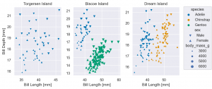
facet を利用する場合、パネルごとに異なる領域を強調するなら、share で調整します。
(
    so.Plot(penguins, x='bill_length_mm', y='bill_depth_mm',
			color='species',
			marker='sex',
			pointsize='body_mass_g')
    .add(so.Dot())
    .facet(col='island') # facet
    .label(x='Bill Length [mm]', y='Bill Depth [mm]',
			title='{} Island'.format) # 以前なら、xlabel, ylabel を指定して設定しましたが、単にx(y)でok
    .share(x=False, y=False) # facet ごとに x, y の領域を自動的に調整
    .scale(color='colorblind', marker={'Male': 'v', 'Female': '^'}) # 修正
    .layout(size=(8, 4)) # figure size
)
以前の seaborn のAPIなら、以下のようにすれば同等の図が作成できます。
g = sns.relplot(penguins,
		x='bill_length_mm', y='bill_depth_mm',
		style='sex', hue='species', size='body_mass_g',
		col='island'
)
g.set(xlim=(20, 70), ylim=(10,25), xlabel='Bill Length [mm]', ylabel='Bill Depth [mm]')
g.set_titles('{col_name} Island')
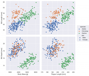
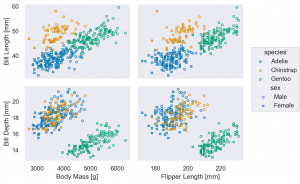
pair 複数の x, y 軸
pair を利用する場合、Plot では、x, y は指定せずに、pair の layer で設定します。
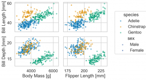
(
    so.Plot(penguins)
    .pair(x=['body_mass_g', 'flipper_length_mm'], y=['bill_length_mm',
	    'bill_depth_mm'])
    .add(so.Dot(), color='species', marker='sex')
    .label(x0='Body Mass [g]', x1='Flipper Length [mm]', y0='Bill Length [mm]', y1='Bill Depth [mm]')
    .layout(size=(8, 8))
)
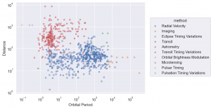
scale log scale での可視化
penguins dataset では、変数の scale の広がりがあまり大きくなかったので、紹介できませんでしたが、scale method で log scale の変換ができます
planets = sns.load_dataset('planets')
print('planets dataset')
print(planets.info())
print(planets.head())

# planets dataset
# <class 'pandas.core.frame.DataFrame'>
# RangeIndex: 1035 entries, 0 to 1034
# Data columns (total 6 columns):
#  #   Column          Non-Null Count  Dtype
# ---  ------          --------------  -----
#  0   method          1035 non-null   object
#  1   number          1035 non-null   int64
#  2   orbital_period  992 non-null    float64
#  3   mass            513 non-null    float64
#  4   distance        808 non-null    float64
#  5   year            1035 non-null   int64
# dtypes: float64(3), int64(2), object(1)
# memory usage: 48.6+ KB
# None
#             method  number  orbital_period   mass  distance  year
# 0  Radial Velocity       1         269.300   7.10     77.40  2006
# 1  Radial Velocity       1         874.774   2.21     56.95  2008
# 2  Radial Velocity       1         763.000   2.60     19.84  2011
# 3  Radial Velocity       1         326.030  19.40    110.62  2007
# 4  Radial Velocity       1         516.220  10.50    119.47  2009
(
    so.Plot(planets, x='orbital_period', y='distance', color='method')
    .add(so.Dots())
    .label(x='Orbital Period', y='Distance')
    .scale(x='log', y='log')
)
on & plot matplotlib API との連携
matplotlib.axes.Axes or matplotlib.figure.Figure を on method で与えて、plot を実行すると matplotlib の図に追加されます。
Dot と Dots の2種類があると述べましたが、Dots の方がたくさん点が重なっていてもわかりやすいです。今後は基本的にはデータの量が多い場合 Dots を使用します。
fig = plt.figure(figsize=(12, 4)) #, layout='constrained')

sf1, sf2 = fig.subfigures(1, 2)

(
    so.Plot(penguins, x='body_mass_g', y='flipper_length_mm')
    .add(so.Dot(), color='species')
    .label(title='Dot')
    .on(sf1).plot()
)

(
    so.Plot(penguins, x='body_mass_g', y='flipper_length_mm')
    .add(so.Dots(), color='species')
    .label(title='Dots')
    .on(sf2).plot()
);
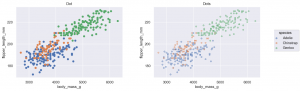
(どうにも legend の box の左端が少し削れてしまっていて気になるのですが、まだ調整中のためのバグでしょうか)
theme テーマの調整色々
各種設定値で見た目を調整しますが、matplotlib の parameter は多岐に渡り複雑なので大変です。 以下のやり方で、既存の seaborn の template が利用可能です。
ただし、theme は、公式ドキュメントに
The API for customizing plot appearance is not yet finalized. Currently, the only valid argument is a dict
of matplotlib rc parameters. (This dict must be passed as a positional argument.) It is likely that this method will
be enhanced in future releases.
とありますので、今後の version up でより簡単に調整ができるようになると思われます。
from seaborn import axes_style, plotting_context
axes_style
- darkgrid (default)
- dark (darkgrid の grid なし)
- whitegrid
- white (whitegrid の grid なし)
- ticks
plotting_context は以下の4種類(順に文字サイズが大きくなる)
- paper
- notebook (default)
- talk
- poster
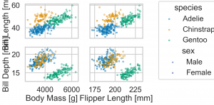
p = (
    so.Plot(penguins)
    .pair(x=['body_mass_g', 'flipper_length_mm'], y=['bill_length_mm', 'bill_depth_mm'])
    .add(so.Dots(), color='species', marker='sex')
    .label(x0='Body Mass [g]', x1='Flipper Length [mm]', y0='Bill Length [mm]', y1='Bill Depth [mm]')
    .scale(color='colorblind')
);
p.theme(axes_style('dark'))
p.theme(axes_style('white'))
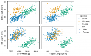
p.theme(axes_style('whitegrid'))

p.theme(axes_style('ticks'))
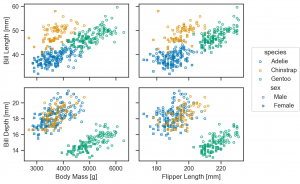
plotting_context は以下のように重ねられ、文字の大きさが変わります。(Python 3.9>= でないと、dictionary を|で結合できないので注意してださい。)
p.theme(axes_style('whitegrid') | plotting_context(context='paper'))
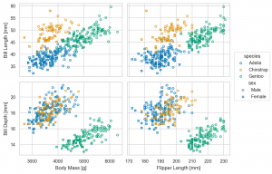
p.theme(axes_style('whitegrid') | plotting_context(context='notebook'))
p.theme(axes_style('whitegrid') | plotting_context(context='talk'))
p.theme(axes_style('whitegrid') | plotting_context(context='poster'))
流石に、figure size を調整しないと poster では、文字が大きすぎますが、状況に応じて(最低限は)大きな文字の方がはっきりと見やすいのでおすすめです。また、default では、darkgrid ですが、これだと Data-ink Ratio (データに使われたインクに対してグラフ全体のインクの量)的に少々煩わしいので tick などを採用していきます。
なお、今回の version 0.12.2 では global に設定変更ができないようなので、毎回 theme で設定しますが、将来的には sns.set のように default の global 設定を指定できると思います。
Matplotlib で日本語を表示したい場合、japanize-matplotlib を利用すると簡単ですが、Seaborn objects interface では、そのままでは日本語が表示できません。japanize-matplotlib を導入していれば、IPAexGothic font が入るので、それを指定する必要があります。
(
    so.Plot(penguins, x='bill_length_mm', y='bill_depth_mm', color='species')
    .add(so.Dots())
    .label(x='嘴の長さ [mm]', y='嘴の幅 [mm]')
    .theme({'font.family': 'IPAexGothic'})
)
もしくは、onとplot method を利用して、matplotlib の Figure か、 Axes object に明示的に plot させる必要があります。
fig, ax = plt.subplots()
(
    so.Plot(penguins, x='bill_length_mm', y='bill_depth_mm', color='species')
    .add(so.Dots())
    .label(x='嘴の長さ [mm]', y='嘴の幅 [mm]')
    .on(ax).plot()
);
その他の Mark, Stat, Move の紹介
基本的な scatter plot の紹介は以上となります。これからは、Dot(s) 以外の Mark や上の例では紹介しなかった、Stat, Move の使い方を具体的な例で紹介します。
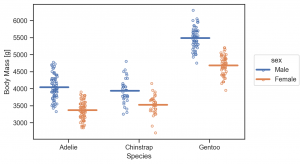
Bar marks Bar, Bars & Stat objects Agg, Hist, Count
& Move objects Dodge, Stack, Jitter
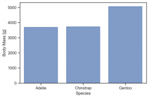
Mark class の Bar (Bars) で bar plot が作成可能です。これはデータの集約(平均など)は、 Agg を利用して計算します。この object は、Agg(func='median') のように様々な関数が指定可能です(default = ‘mean’)。なお、color を指定して複数の Bar が重なる場合には、Move class の Doge を与えて調整します。
(
    so.Plot(penguins, x='species', y='body_mass_g')
    .add(so.Bar(), so.Agg(func='mean')) # func を指定もできる(default: mean)
    .label(x='Species', y='Body Mass [g]')
    .layout(size=(6, 4))
    .theme(axes_style('ticks'))
)
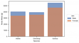
color を指定して grouping した際に、そのまま add(so.Bar(), so.Agg()) だとこのよう重なる点に注意してください。
(
    so.Plot(penguins, x='species', y='body_mass_g', color='sex')
    .add(so.Bar(), so.Agg())
    .label(x='Species', y='Body Mass [g]')
    .layout(size=(6, 4))
    .theme(axes_style('ticks'))
)
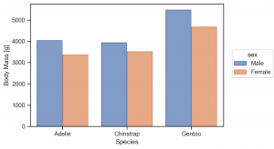
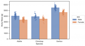
so.Dodge() を追加し、調整します。
(
    so.Plot(penguins, x='species', y='body_mass_g', color='sex')
    .add(so.Bar(), so.Agg(), so.Dodge())
    .label(x='Species', y='Body Mass [g]')
    .layout(size=(6, 4))
    .theme(axes_style('ticks'))
)
この bar plot に更に add で Mark class を簡単に重ねられます。
(
    so.Plot(penguins, x='species', y='body_mass_g', color='sex')
    .add(so.Bar(), so.Agg(), so.Dodge())
    .add(so.Dots(), so.Dodge()) # Dots にも Dodge を忘れずに
    .label(x='Species', y='Body Mass [g]')
    .layout(size=(6, 4))
    .theme(axes_style('ticks'))
)
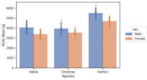
ただ、Dots は、Dodge だけでは重なって分かりにくいですね。その場合、さらに Jigger を重ねて作用させて、点を分散させます。
(
    so.Plot(penguins, x='species', y='body_mass_g', color='sex')
    .add(so.Bar(), so.Agg(), so.Dodge())
    .add(so.Dots(), so.Dodge(), so.Jitter()) # Dodge を忘れずに
    .label(x='Species', y='Body Mass [g]')
    .layout(size=(6, 4))
    .theme(axes_style('ticks'))
)
Bars これは集計の区分が連続的な場合に利用します。
(
    so.Plot(penguins, x='body_mass_g', color='species')
    .add(so.Bars(), so.Hist(stat='count'))
    .label(title='so.Hist(count)', x='Body Mass [g]', y='Count')
    .layout(size=(6, 4))
    .theme(axes_style('ticks'))
)

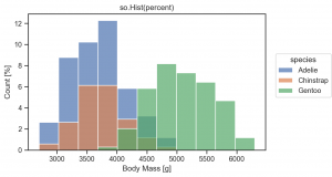
so.Hist(stat='percent') で件数でなく、簡単に割合を計算できます。
(
    so.Plot(penguins, x='body_mass_g', color='species')
    .add(so.Bars(), so.Hist(stat='percent'))
    .label(title='so.Hist(percent)', x='Body Mass [g]', y='Count [%]')
    .layout(size=(6, 4))
    .theme(axes_style('ticks'))
)
Mark classを積み上げたい場合には、Stack を使用します。
(
    so.Plot(penguins, y='island', color='species')
    .add(so.Bar(), so.Hist(), so.Stack())
    .label(x='count')
    .layout(size=(4, 2))
    .theme(axes_style('ticks'))
)
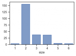
so.Count() は so.Hist(stat='count') のように件数のカウントするだけの集約関数ですが、横軸が数値の時に binning せずにカテゴリーとして集約するという差があります。(ex. アンケートの5段階評価の集計など)
tips = sns.load_dataset('tips')
print('tips dataset')
print(tips.info())
print(tips.head())

# tips dataset
# <class 'pandas.core.frame.DataFrame'>
# RangeIndex: 244 entries, 0 to 243
# Data columns (total 7 columns):
#  #   Column      Non-Null Count  Dtype
# ---  ------      --------------  -----
#  0   total_bill  244 non-null    float64
#  1   tip         244 non-null    float64
#  2   sex         244 non-null    category
#  3   smoker      244 non-null    category
#  4   day         244 non-null    category
#  5   time        244 non-null    category
#  6   size        244 non-null    int64
# dtypes: category(4), float64(2), int64(1)
# memory usage: 7.4 KB
# None
#    total_bill   tip     sex smoker  day    time  size
# 0       16.99  1.01  Female     No  Sun  Dinner     2
# 1       10.34  1.66    Male     No  Sun  Dinner     3
# 2       21.01  3.50    Male     No  Sun  Dinner     3
# 3       23.68  3.31    Male     No  Sun  Dinner     2
# 4       24.59  3.61  Female     No  Sun  Dinner     4
so.Count() と so.Hist(stat='count')の2種類の集計方法を比較してみます。
fig = plt.figure(figsize=(14, 4), layout='constrained')

sf1, sf2 = fig.subfigures(1, 2)

p1 = (
    so.Plot(tips, x='size')
    .add(so.Bar(), so.Count())
    .label(title='so.Count')
    .theme(axes_style('ticks'))
    .on(sf1).plot()
)

p2 = (
    so.Plot(tips, x='size')
    .add(so.Bar(), so.Hist())
    .label(title='so.Hist')
    .theme(axes_style('ticks'))
    .on(sf2).plot()
)
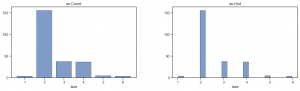
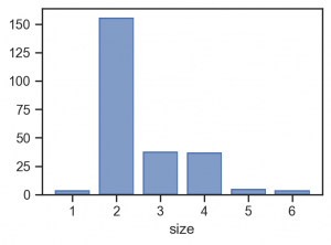
so.Hist() では、default では、binning されて不自然になっています。 なお、so.Hist(discrete=True) を指定すれば適切に集計されます。
(
    so.Plot(tips, x='size')
    .add(so.Bar(), so.Hist(discrete=True))
    .layout(size=(4, 3))
    .theme(axes_style('ticks'))
)
もしくは、scale(x=so.Nominal()) で変換しても同様の結果となります。(Count 不要では?)
(
    so.Plot(tips, x='size')
    .add(so.Bar(), so.Hist())
    .layout(size=(4, 3))
    .theme(axes_style('ticks'))
    .scale(x=so.Nominal())
)
Line marks DashMark
Dash は Dot(s) のように各データ点ごとに線をプロットします。
(
    so.Plot(penguins, x='species', y='flipper_length_mm', color='sex')
    .add(so.Dash(alpha=0.5), linewidth='body_mass_g')
    .label(x='Species', y='Flipper Length [mm]')
    .layout(size=(6, 4))
    .theme(axes_style('ticks'))
)
(
    so.Plot(penguins, x='species', y='flipper_length_mm', color='sex')
    .add(so.Dash(), so.Dodge())
    .label(x='Species', y='Flipper Length [mm]')
    .layout(size=(6, 4))
    .theme(axes_style('ticks'))
)
平均値など集計と Dots を重ねる際に良さそうです。
(
    so.Plot(penguins, x='species', y='body_mass_g', color='sex')
    .add(so.Dash(linewidth=3), so.Agg(), so.Dodge())
    .add(so.Dots(), so.Dodge(), so.Jitter())
    .label(x='Species', y='Body Mass [g]')
    .layout(size=(6, 4))
    .theme(axes_style('ticks'))
)
Line marks Line, Lines & Stat objects Norm, PolyFit
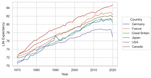
penguin data set では、あまり例として利用しにくいので、ここで healthexp dataset を利用します。これは、1970-2020 のアメリカや日本など7カ国の平均寿命、医療費(?)のデータで、元はこのサイト Our World のデータのようです。
healthexp = sns.load_dataset('healthexp')
print(healthexp.info())
# RangeIndex: 274 entries, 0 to 273
# Data columns (total 4 columns):
#  #   Column           Non-Null Count  Dtype
# ---  ------           --------------  -----
#  0   Year             274 non-null    int64
#  1   Country          274 non-null    object
#  2   Spending_USD     274 non-null    float64
#  3   Life_Expectancy  274 non-null    float64
# dtypes: float64(2), int64(1), object(1)
# memory usage: 8.7+ KB
(
    so.Plot(healthexp, x='Year', y='Life_Expectancy', color='Country')
    .add(so.Line())
    .label(y='Life Expectancy')
    .layout(size=(6, 4))
    .theme(axes_style('whitegrid'))
)
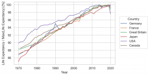
Stat objects Norm を利用すると scale を調整できます。
so.Norm(func='max', where=None, by=None, percent=False)
上のように default では、最大値で規格化した比ですが、percent にしたり、where="x == x.min()" とすると x の最小値を基準にするなど色々と調整可能です。
(
    so.Plot(healthexp, x='Year', y='Life_Expectancy', color='Country')
    .add(so.Lines(), so.Norm(percent=True))
    .label(y='Life Expectancy / Max(Life Expectancy) [%]')
    .layout(size=(6, 4))
    .theme(axes_style('whitegrid'))
)
Line と組み合わせて利用する Stat class で、PolyFit というものがあります。これは多項式でフィットしてくれます。
(
    so.Plot(penguins, x='bill_length_mm', y='bill_depth_mm', color='species')
    .add(so.Dots())
    .add(so.Line(), so.PolyFit(order=1))
    .label(x='Bill Length [mm]', y='Bill Depth [mm]')
    .layout(size=(6, 4))
    .theme(axes_style('whitegrid'))
)
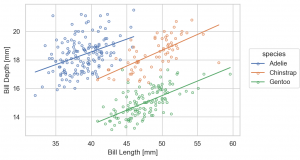
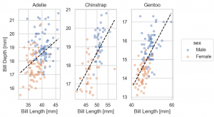
なお、シンプソンのパラドックスとして知られているように、この種の相関関係の分析では、データの層に注意が必要です。時として、誤った相関関係を結論してしまうので注意が必要です。
(
    so.Plot(penguins, x='bill_length_mm', y='bill_depth_mm', color='sex')
    .facet(col='species')
    .share(x=False, y=False)
    .add(so.Dots())
    .add(so.Line(), so.PolyFit(order=1))
    .label(x='Bill Length [mm]', y='Bill Depth [mm]')
    .layout(size=(6, 4))
    .theme(axes_style('whitegrid'))
)
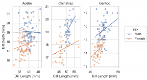
なお、so.Plot の layer で指定した color は、下層で影響しますが、各層で別途指定できます。以下の例では、color='sex' の指定は、so.Plot の layer ではなく、 so.Dots() で与えています。そのため、so.Line() の layer では、影響されず区別する前のデータで fit されています。
(
    so.Plot(penguins, x='bill_length_mm', y='bill_depth_mm')
    .add(so.Dots(), color='sex')
    .add(so.Line(color='black', linestyle='--'), so.PolyFit(order=1)) # so.Dots() color の影響は受けない
    .facet(col='species')
    .share(x=False, y=False)
    .label(x='Bill Length [mm]', y='Bill Depth [mm]')
    .layout(size=(6, 4))
    .theme(axes_style('whitegrid'))
)
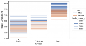
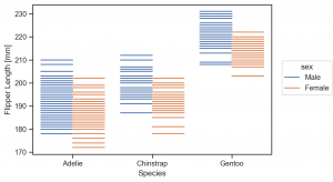
Line marks Range & Stat objects Est, Perc
Mark class の Range は、エラー・バーのプロットに利用します。そして、データの誤差や分布を集計するクラスが、Est や Perc です。
(
    so.Plot(penguins, x='body_mass_g', y='species', color='sex')
    .add(so.Dot(), so.Agg(), so.Dodge())
    .add(so.Range(), so.Est(), so.Dodge())
    .label(x='Body Mass [g]', y='species')
    .layout(size=(6, 4))
    .theme(axes_style('whitegrid'))
)
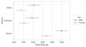
Est(func='mean', errorbar=('ci', 95)) と default の誤差は、bootstrap 95 CI でされますが、以下の4種類が選択できます。
errorbar=('sd', scale): standard deviationerrorbar=('se', scale): standard errorerrorbar=('pi', width): percentile intervalerrorbar=('ci', width): confidence interval
参考資料 : Statistical estimation and error bar (Seaborn)
(
    so.Plot(penguins, x='body_mass_g', y='species', color='sex')
    .add(so.Dot(), so.Agg(), so.Dodge())
    .add(so.Range(), so.Est(errorbar='sd'), so.Dodge())
    .label(x='Body Mass [g]', y='species')
    .layout(size=(6, 4))
    .theme(axes_style('whitegrid'))
)
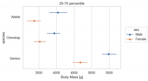
Perc では Percentile を集計できます。default では、0, 25, 50, 75, 100 percentile を集計しますが、オプションで指定できます。
(
    so.Plot(penguins, y='species', x='body_mass_g', color='sex')
    .add(so.Dot(), so.Agg(), so.Dodge())
    .add(so.Range(), so.Perc([25, 75]), so.Dodge())
    .label(title='25-75 percentile', x='Body Mass [g]', y='species')
    .layout(size=(6, 4))
    .theme(axes_style('whitegrid'))
)
Line marks Path, Paths
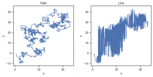
Path (Paths) は、Line (Lines)と似ていますが、Lineが、与えられたデータを並び変えてしまうのに対して、Pathは、データをそのままの順番でプロットする点が違います。そのため平面状で動く点の軌道のようなデータを可視化する際に利用します。具体的に random walk を可視化してみます。Line では、データ点が並び変わっておかしくなっています。
np.random.seed(1)

n_step = 1024
df = pd.DataFrame(np.random.randn(n_step, 2), columns=['x', 'y']).cumsum()

fig = plt.figure(figsize=(8, 4), layout='constrained')

sf1, sf2 = fig.subfigures(1, 2)

(
    so.Plot(df, x='x', y='y')
    .add(so.Path())
    .label(title='Path')
    .theme(axes_style('ticks'))
    .on(sf1).plot()
)

(
    so.Plot(df, x='x', y='y')
    .add(so.Line())
    .label(title='Line')
    .theme(axes_style('ticks'))
    .on(sf2).plot()
);
Fill marks Band
Band : これはエラー・バンドの表示に利用できます。
Gapminder data set をここでは利用します。これは過去数十年の世界各国の平均寿命やGDP、人口がなどまとめられています。
gapminder = px.data.gapminder()
gapminder.info()

# RangeIndex: 1704 entries, 0 to 1703
# Data columns (total 8 columns):
#  #   Column     Non-Null Count  Dtype
# ---  ------     --------------  -----
#  0   country    1704 non-null   object
#  1   continent  1704 non-null   object
#  2   year       1704 non-null   int64
#  3   lifeExp    1704 non-null   float64
#  4   pop        1704 non-null   int64
#  5   gdpPercap  1704 non-null   float64
#  6   iso_alpha  1704 non-null   object
#  7   iso_num    1704 non-null   int64
# dtypes: float64(2), int64(3), object(3)
# memory usage: 106.6+ KB
(
    so.Plot(gapminder, x='year', y='lifeExp', color='continent')
    .add(so.Lines(linewidth=0.5), group='country') # group を指定しないと、country 単位で plot されないので注意
    .layout(size=(6, 4))
    .theme(axes_style('whitegrid'))
)
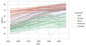
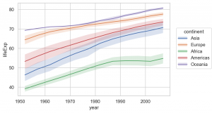
これを Aggで平均を、Estで誤差を集計して可視化すると以下の図が得られます。
(
    so.Plot(gapminder, x='year', y='lifeExp', color='continent')
    .add(so.Lines(), so.Agg()) # average
    .add(so.Band(), so.Est())
    .layout(size=(6, 4))
    .theme(axes_style('whitegrid'))
)
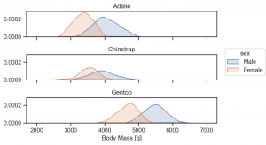
Fill marks Area & Stat objects KDE
Area は線の間を塗りつぶします。また、KDE は、Kernel Density Estimation でデータの分布を推定します。
(
    so.Plot(penguins, x='body_mass_g', color='sex')
    .facet(row='species')
    .add(so.Area(), so.KDE())
    .label(x='Body Mass [g]')
    .layout(size=(6, 4))
    .theme(axes_style('ticks'))
)
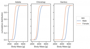
so.KDE(cumulative=True) と指定すれば、累積値も計算できます。
(
    so.Plot(penguins, x='body_mass_g', color='sex')
    .facet(col='species')
    .add(so.Lines(), so.KDE(cumulative=True, common_norm=False))
    .label(x='Body Mass [g]', y='cumulative distribution')
    .layout(size=(6, 4))
    .theme(axes_style('ticks'))
)
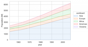
Area の利用して、このような積み上げ線グラフも作成できます。
(
    so.Plot(gapminder, x='year', y='pop', color='continent')
    .add(so.Area(), so.Agg(func=lambda x: x.sum()/1e6), so.Stack())
    .label(y='Population [M]')
    .limit(x=(gapminder.year.min(), gapminder.year.max()))
    .scale(color='pastel')
    .layout(size=(6, 4))
    .theme(axes_style('whitegrid'))
)
Text marks Text & Move objects Shift
Text では、text=... で指定した column の文字や数字を表示します。
glue = sns.load_dataset('glue')
print('glue dataset : 自然言語処理のタスクのモデル名と各種タスクのスコア')
print(glue.info())

# glue dataset : 自然言語処理のタスクのモデル名と各種タスクのスコア
# RangeIndex: 64 entries, 0 to 63
# Data columns (total 5 columns):
#  #   Column   Non-Null Count  Dtype
# ---  ------   --------------  -----
#  0   Model    64 non-null     object
#  1   Year     64 non-null     int64
#  2   Encoder  64 non-null     object
#  3   Task     64 non-null     object
#  4   Score    64 non-null     float64
# dtypes: float64(1), int64(1), object(3)
# memory usage: 2.6+ KB
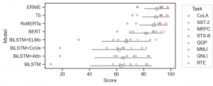
ここで一旦練習として、モデルの Task ごとのスコアと平均・誤差を可視化してみます。
Shift で表示される位置を微調整します。このような複雑な層を重ねることは従来のAPIでは、非常に難しかったですが、 今回の objects interface により直感的かつ簡単になりました。
(
    so.Plot(glue, y='Model', x='Score')
    .add(so.Dots(), color='Task') # task ごとの score
    .add(so.Dot(color='white', edgecolor='black', marker='s'), so.Agg(func='mean'), so.Shift(y=.2)) # average score
    .add(so.Range(color='black', alpha=0.5), so.Est(errorbar='sd'), so.Shift(y=.2)) # error bar
    .layout(size=(6, 3))
    .theme(axes_style('ticks'))
)
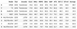
この dataframe ですが、 API Reference にある例を試すのには少々形式が違っていたので修正します。
_glue = (
    glue.pivot_table(index=['Model', 'Year', 'Encoder'], columns='Task', values='Score')
    .assign(Average=lambda df: df.mean(axis=1).round(1))
    .reset_index().rename_axis(columns=None)
    .sort_values('Average', ascending=False)
)
_glue
以下のように、Plot で text として指定した要素を add(so.Text()) でプロットできます。
(
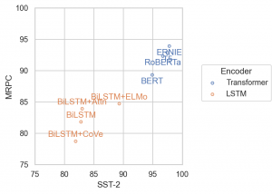
so.Plot(_glue, x='SST-2', y='MRPC', text='Model', color='Encoder')
.add(so.Dots())
.add(so.Text(), valign='Encoder')
.limit(x=(75, 100), y=(75, 100))
.layout(size=(4, 4))
.theme(axes_style('whitegrid'))
)
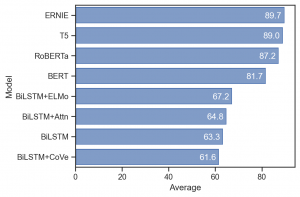
もちろん、数字の表示も可能です。
(
    so.Plot(_glue, x='Average', y='Model', text='Average')
    .add(so.Bar())
    .add(so.Text(color='white', halign='right'))
    .layout(size=(6, 4))
    .theme(axes_style('ticks'))
)
まとめ
さて、ざっと、seaborn objects interface を紹介しました。直感的にデータを加工・可視化でき非常に使いやすくなりました。従来は、データをどのように可視化したいか、まず関数を選ぶ必要があり、その後の加工も Matplotlib の APIを利用したりと直感的ではなかったです。新しい手法では、データをどう加工したいのか、層ごとに追加していくことで、集計値や分散など異なった層の可視化を簡単に重ねられるようになりました。また、集計関数や誤差評価の基準などを簡単に変更できるようになった点も便利です。
まだ、box plot や violin plot、heatmap など、既存の機能すべてが実装されてはいませんが、今後の更新に期待しています。
グループ研究開発本部 AI研究開発室では、データサイエンティスト/機械学習エンジニアを募集しています。ビッグデータの解析業務などAI研究開発室にご興味を持って頂ける方がいらっしゃいましたら、ぜひ 募集職種一覧 からご応募をお願いします。皆さんのご応募をお待ちしています。
参考資料
- Seaborn 公式サイト
- Seaborn Objects について
- Data Set
- Grammar of Graphics について
- The Grammar of Graphics: Leland Wilkinson による教科書
- A layered grammar of graphics: Hadley Wickham による論文
- A Comprehensive Guide to the Grammar of Graphics for Effective Visualization of Multidimensional Data: Towards Data Science の解説資料
グループ研究開発本部の最新情報をTwitterで配信中です。ぜひフォローください。
Follow @GMO_RD